The highest number of architectural concepts are tested in Asia. Clients are attempting to better understand the sometimes confusing offering presented to them. The infrastructures put in place are aimed at a luxury clientele always on the hunt for novelty, surprise and innovation. In Japan and China, we have seen two double-faceted boutiques playing on both a Baroque side and an ultra-minimalist side. The question is knowing how to choose your camp.
Selected by
The La Moitié café in China
La Moitié is a recently opened high-end coffee shop and women’s store in Wanbo, a leafy suburb in southern Guangzhou, China. The shop spans 326 m² spread over three floors and has a bold interior design created by One Fine Day Studio & Partners.
Selected by
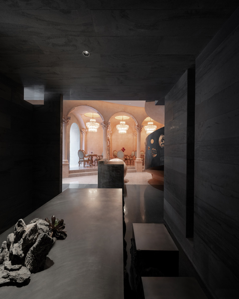
The shop’s name La Moitié more or less reveals the dichotomy of the chosen concept – two visually different spaces, one side captured in pink and full of frills, the other black and discreet.
Selected by
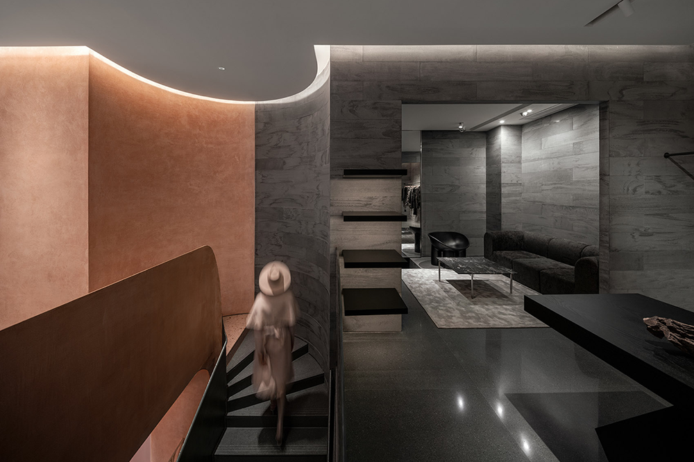
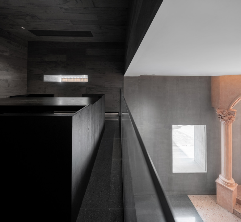
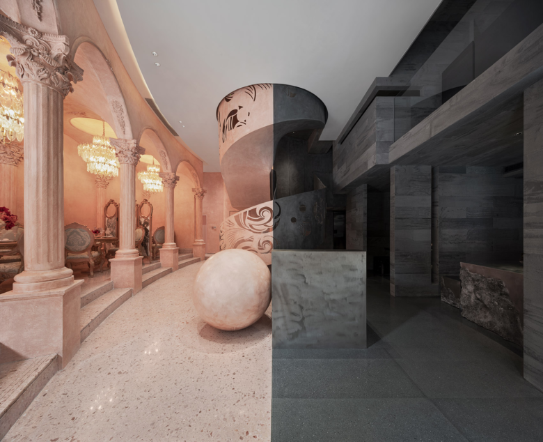
On entering the hall, the two sides are immediately visible and contrasting. The café side with its arches, columns and chandeliers in a Baroque-inspired style is paired with a sales section with discreet detailing captured in black stone. A spiral staircase right in the middle underscores this opposition: it is both pink and black, as if to accentuate the clear colour division.
Selected by
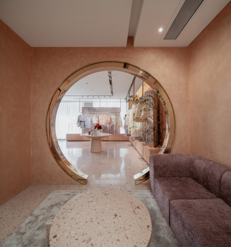
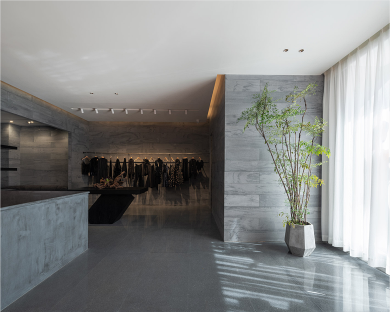
On the upper floor, La Moitié houses the flagship store of the Chinese fashion brand Cheng with its women’s collections presented in an entirely pink setting with a marble floor and pink-tinted stucco walls, while the men’s line is displayed surrounded by walls and floors covered in black granite, with sculptural furniture and hanging steel clothing racks.
Selected by
Selected by
L’Officine Universelle Buly in Japan
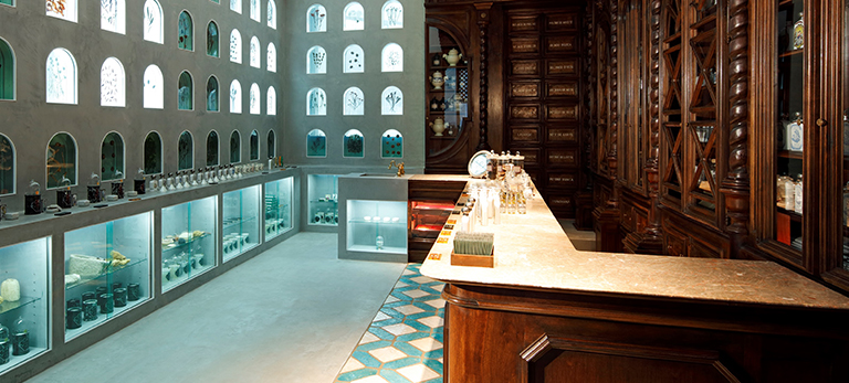
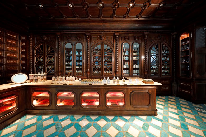
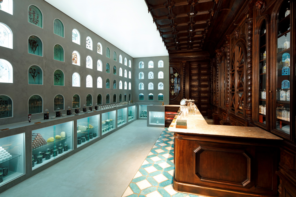
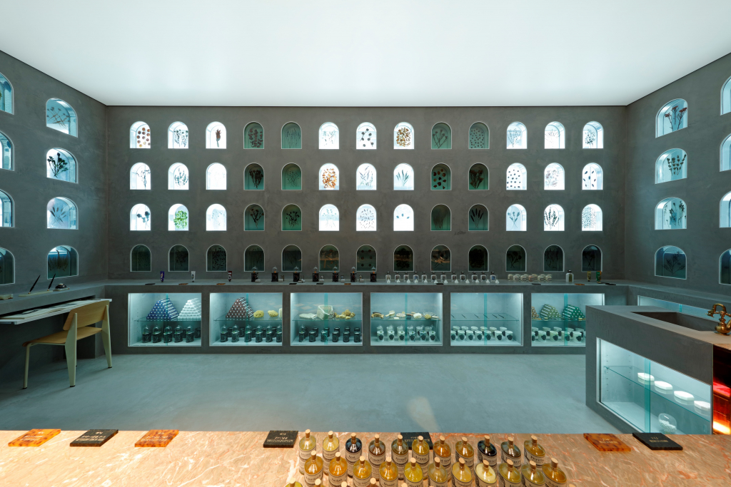
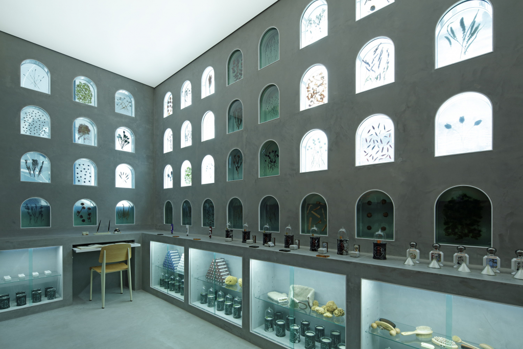
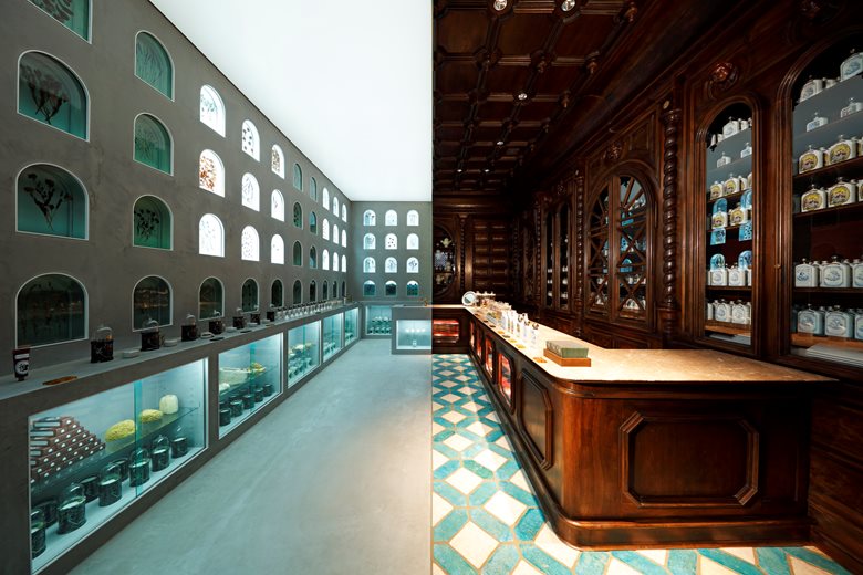
The L’Officine Universelle Buly shop in Tokyo boasts an architectural extravagance: a space that embodies the bridges built by L’Officine between eras and cultures. The interior design of this new Japanese retail outlet arises from their general concept.
Selected by
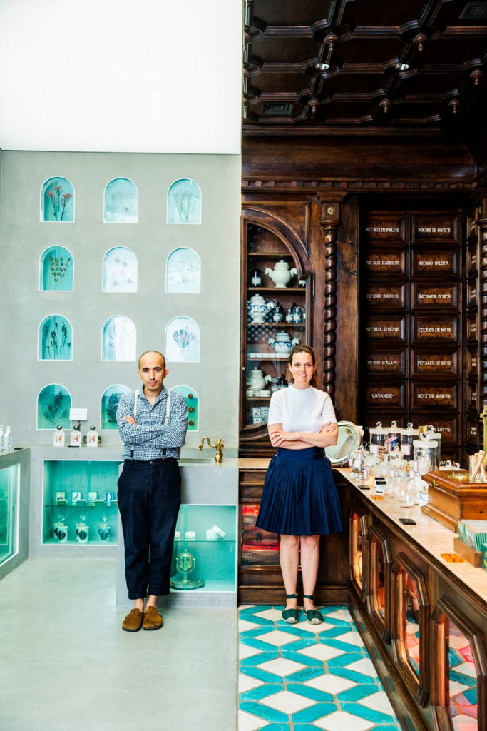
Half of this bisected store is straight from 19th-century France, decorated with precious and richly ornate woodwork. Hidden by the woodwork, a trompe l’oeil feature is reminiscent of the subtle pomp of French châteaux. The sole aim of this move was to construct this fragment of 19th-century French history.
Selected by
Selected by
The other half of the store, like a mirror reflection, was designed by Japanese craftsmen. It boasts more contemporary lines entirely in polished concrete and fashioned with elegance, precision and minimalism.
Selected by
Selected by
Selected by

