September 29th 2022 – By Promostyl
AESOP BY ODAMI; VICTORIAN CHARM
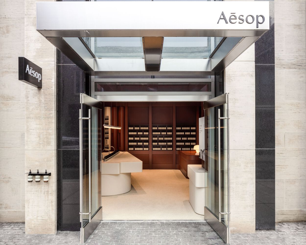
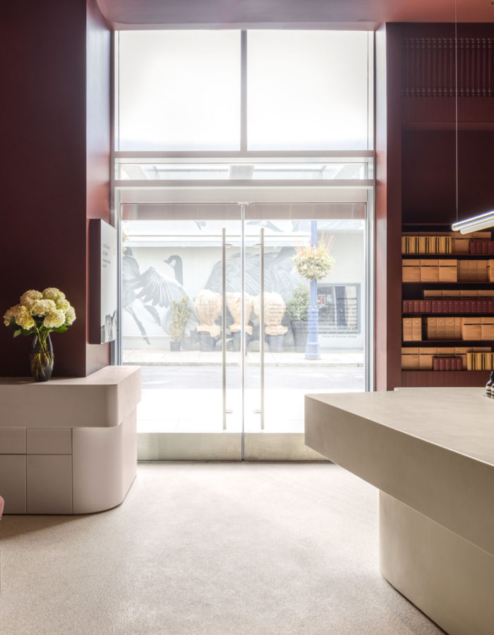
The skin-care brand Aesop has opened a new store in the atypical Yorville neighborhood in Toronto. Designed by the Spanish-Canadian architectural studio Odami, they wanted to pay tribute to this most original neighborhood. Yorkville is one of the only neighborhoods in Toronto that did not undergo modernization in the 60's. It has kept its Victorian charm and its human size, making it lively and animated.
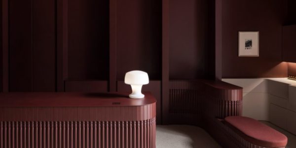
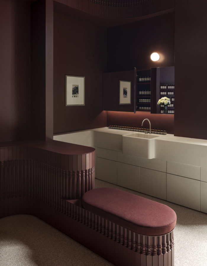
The interior of the store is inspired by this area rich in history, the walls are decorated with wooden balusters emphasizing the verticality of the place and its Victorian style. The space is painted a warm and welcoming ruby, all contrasted by this white epoxy floor and the tables displaying the products symmetrically. Above their sink and their new range well aligned is a thin metallic light fixture, which allows bringing all its attention to their minimalist packaging. In contrast to this Victorian style, there are these small white spaces where the products are presented but also these 3 cylinders embedded in the wall, with a library of Aesop aromas as well as an airlock allowing you to soak your clothes with one of their delicate fragrances.
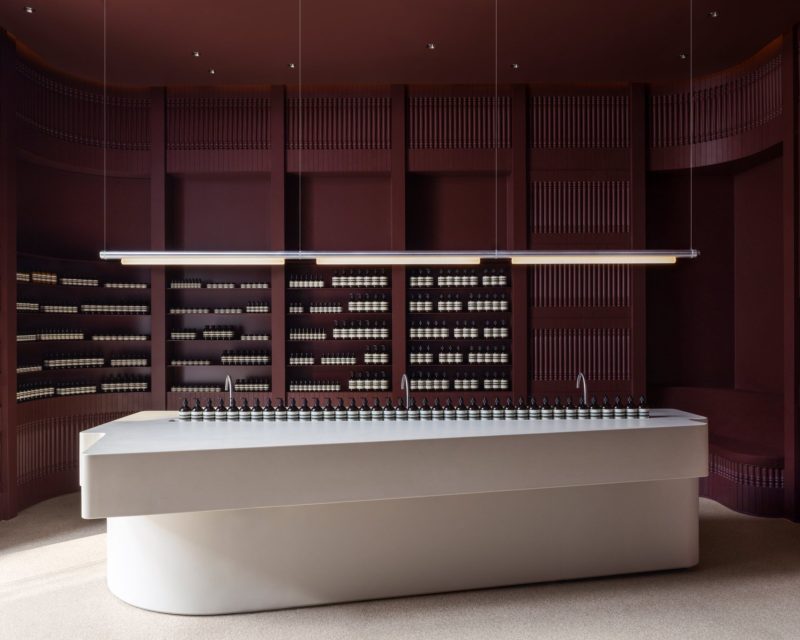
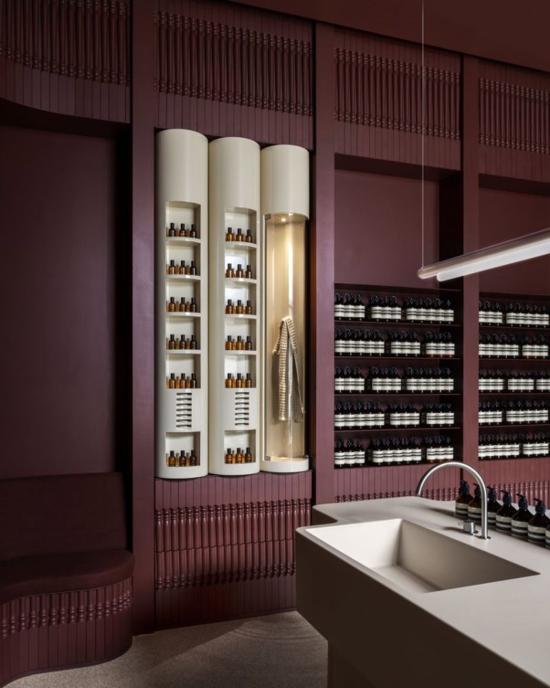
Odami studio managed to convey all the charm and friendliness of the Victorian style of the Yorkville neighborhood in this store while adding some design elements that blend perfectly with each other. This white and deep burgundy, which are very distinct colors, help to showcase the products elegantly. This Victorian vibe and its ruby color can be found in our elitist section of our latest TrendBook Design Retail. The new Aesop store is a perfect match for the future trends predicted by Promostyl.

