While some see the future of retail as virtual reality experiences, holograms of their products and on-store purchasing in less than two clicks, such as Farfetch, which launched its pop-up in London last year, certain luxury brands are approaching cutting-edge designers and collectors to create a real gallery store. It’s goodbye to impulse buys in a flash; some brands now prefer to preach a slow approach. In line with current trends, they are deciding to recreate exclusive worlds with few items but an extremely cutting-edge selection, thus creating a certain minimalism and above all a world unique to them.
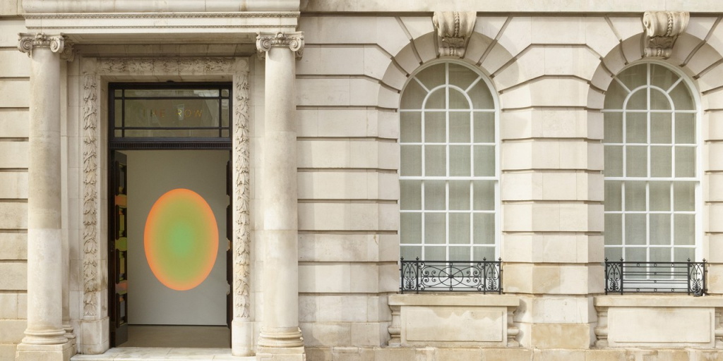
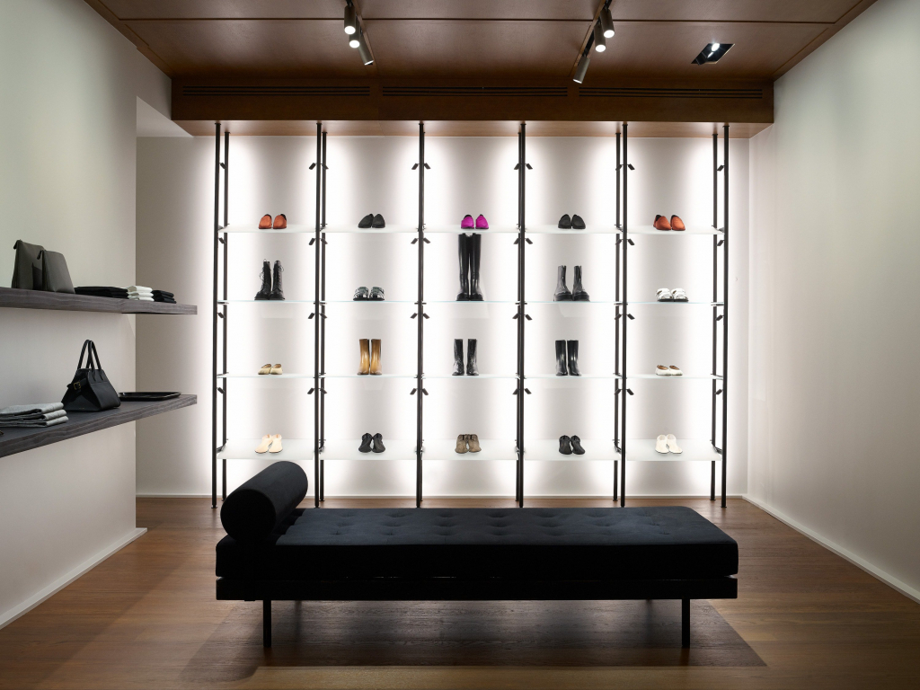
London: The latest The Row store from the Olsen sisters.
The showcase is located in London’s upmarket Mayfair district. It occupies 530 m² of Mayfair House, a large Neo-Georgian townhouse built in the 1920s, the interior of which has been designed by the architecture firm Selldorf in New York.
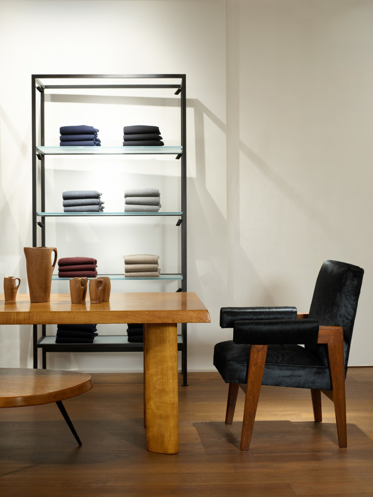
Similar to stores previously opened by The Row, the new sales space resembles a private home in which each piece is a designer item, with a backdrop of white walls, polished concrete and parquet flooring. The tone is set once through the door with a work by James Turrell. Exploring further you come across Le Corbusier chairs, a Giò Ponti sofa on the ground floor and a dining room table by Charlotte Perriand on the first floor. The Row clothing and accessories beautifully enhance the pieces in this art gallery, in a minimal glass and metal design.
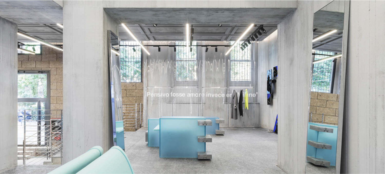
Milan: MSGM in collaboration with Dutch designer Sabine Marcelis
The Italian brand set up its new store in Milan’s Brera district to mark its tenth anniversary. A new store with new dimensions, covering 440 m² spread over two levels on the ground floor of a historic building.
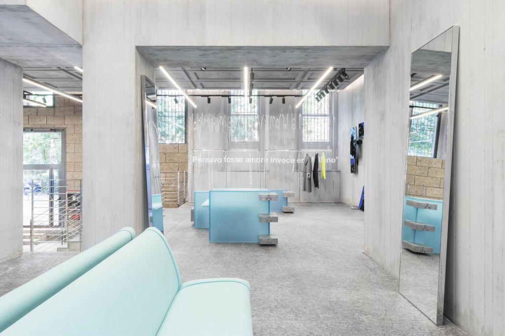
A 17th-century townhouse known as Palazzo Silva di Biandrate. Marking a return to its roots for this space, the interior design devised by MSGM’s creative director Massimo Giorgetti and the Milanese architecture firm ML Architettura introduces new codes: inspired by Brutalist architecture, it contrasts with the ornate historic facade.
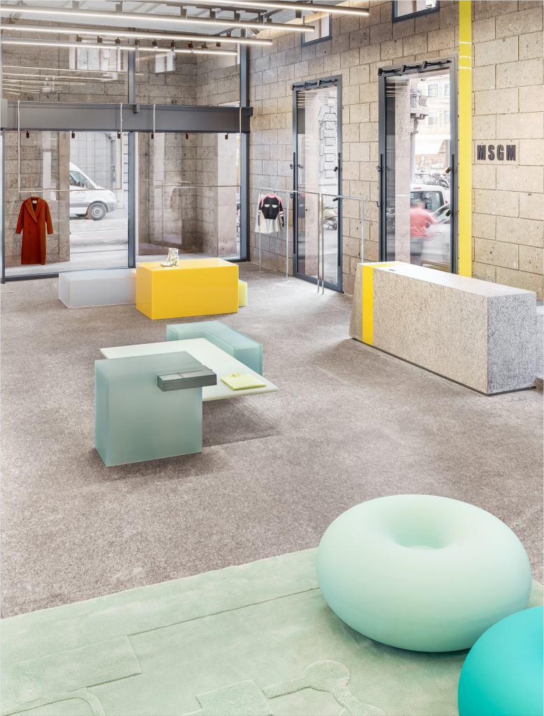
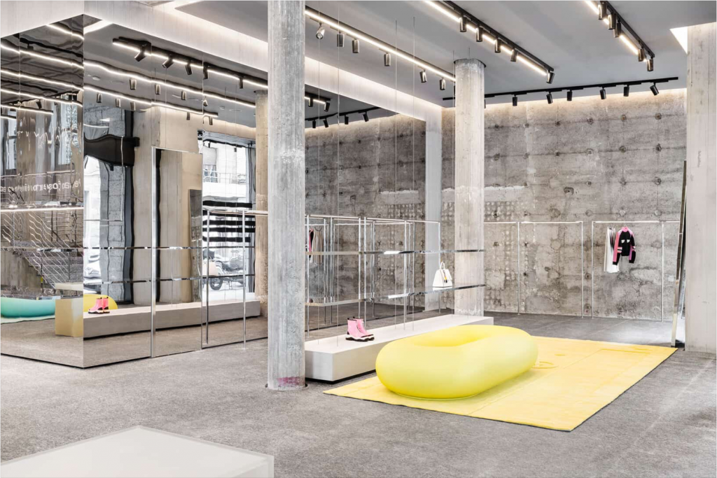
Its interior design is streamlined and understated, taking full advantage of its exposed concrete shell used as a backdrop. Abundant concrete is teamed with stone tiles, reflective and chrome steel, and coloured and translucent display units commissioned from Sabine Marcelis, merged with hanging LED screens. A raw stripped-back space where the designer pieces and the brand’s clothing are showcased in equal measure.
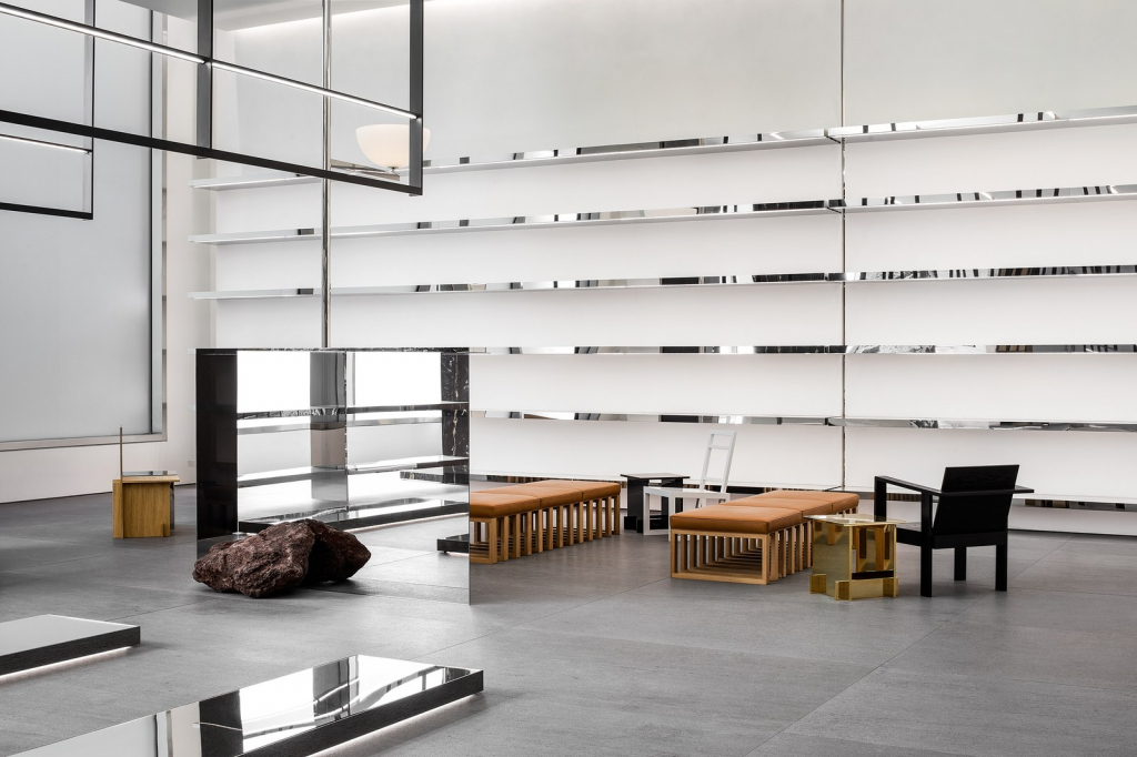
New York: Celine rolls out its new store concept by Hedi Slimane
Slimane has designed all the spaces in collaboration with Celine’s in-house team. Although each store is unique, they share common features, such as the emphasis placed on natural stone and other bold materials.
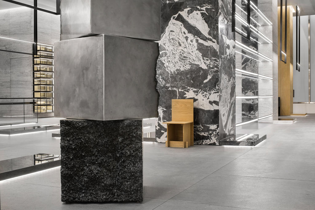
Massive and richly veined slabs made of marble, granite and travertine appear on the walls, shelves and columns, while the floors are covered in Basaltina lava stone. Slimane has already experimented with furniture designs over the years and has created a new collection for Celine stores that rubs shoulders with vintage pieces from the sixties and seventies that showcase French woodworking expertise.
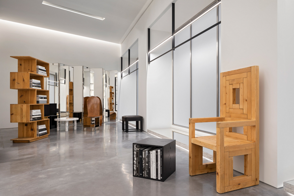
Their shapes are often minimalist, with raw and primitive elements. Contemporary artworks by established and emerging talents, whether acquired or commissioned, represent another major feature of these spaces, an initiative dubbed the Celine Art Project.
