We currently live in a constantly changing and moving digital world in which brands never stop communicating about and rethinking their offering. As such, retailers must rework the rhythm of their stores, like by hosting temporary installations and events, without devoting new resources and materials to each staging…
Nowadays, consumers want to see something new every time they walk into a retail store. Architects and interior designers must now create more modular spaces that can be decompartmentalised. A quick overview of our selection.
Selected by 
WeMarket’s strategy
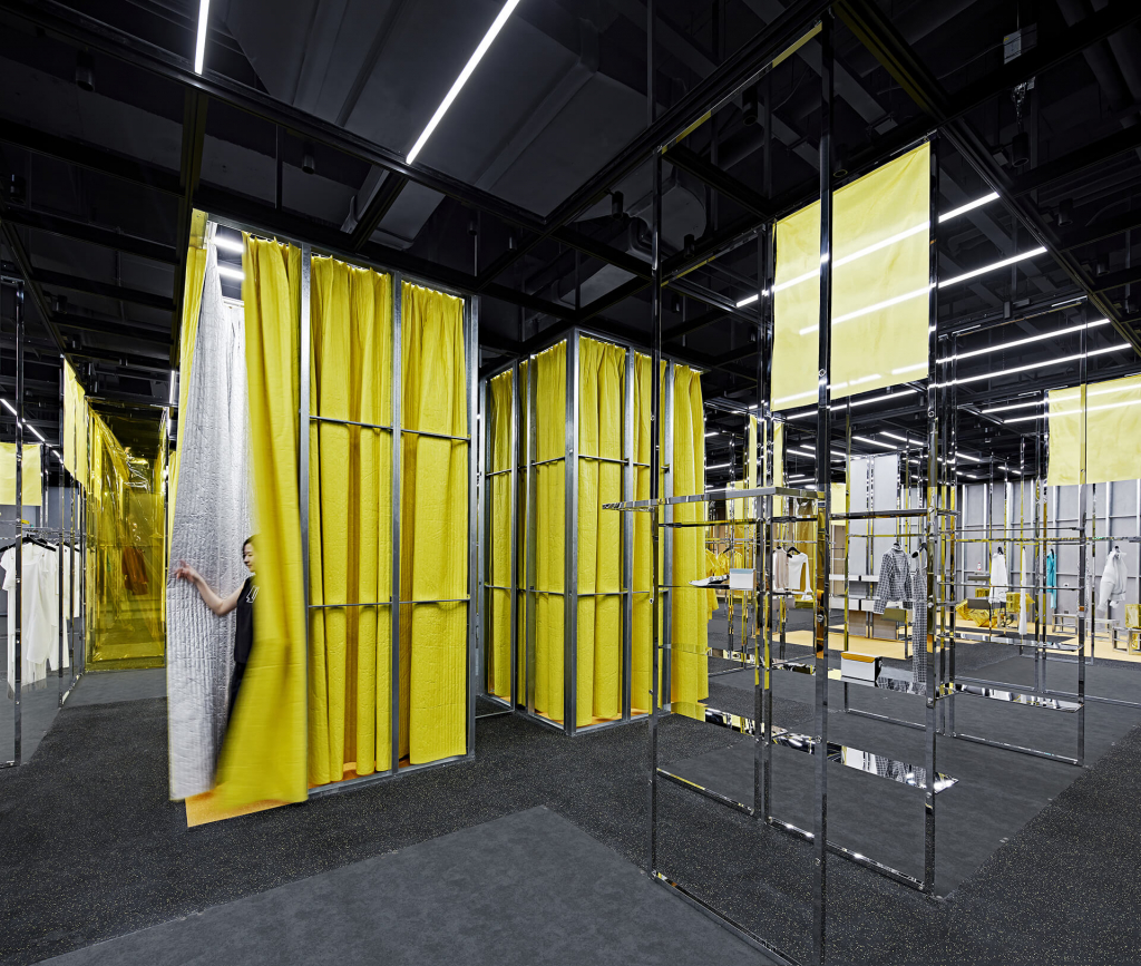
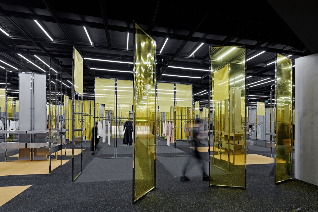
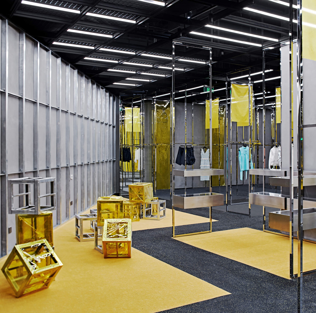
WeMarket is a new retail sales strategy developed by AnyShopStyle, which promotes emerging designers in China. The design studio WAA was tasked with developing a concept that could harmonise this diversity, while leaving room for individual expression.
Selected by 
The solution put forward is a tailor-made system of mobile stainless steel racks with integrated lighting. Designers can choose spaces with three mobile frames in an area measuring 1.8 x 2.7 m and use luminous plinths to define the boundaries. Despite the space’s intentional neutrality, curtains and sofas can be attached to the frames to alter the overall or specific colour palette.
Selected by 
The Pewter concept store
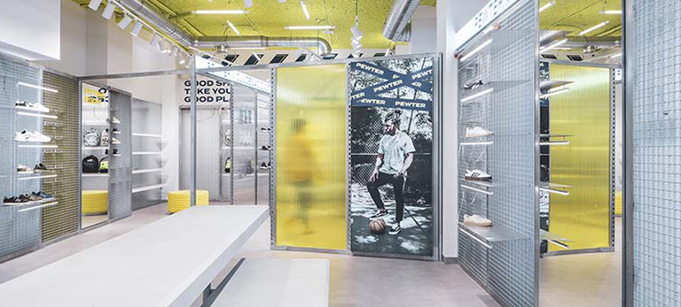
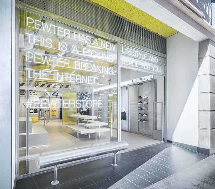
Looking to be much more than a shop, Pewter is both provocative and irreverent. This lifestyle and sportswear concept store in Gandía on the east coast of Spain has been designed as a setting to amaze generations Y and Z, immersed in the all-consuming world of social media. From the street, LED messages attract passers-by to take a simple selfie or invite them to enter and discover the shop.
Selected by 
Selected by 
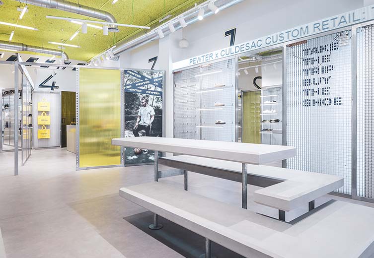
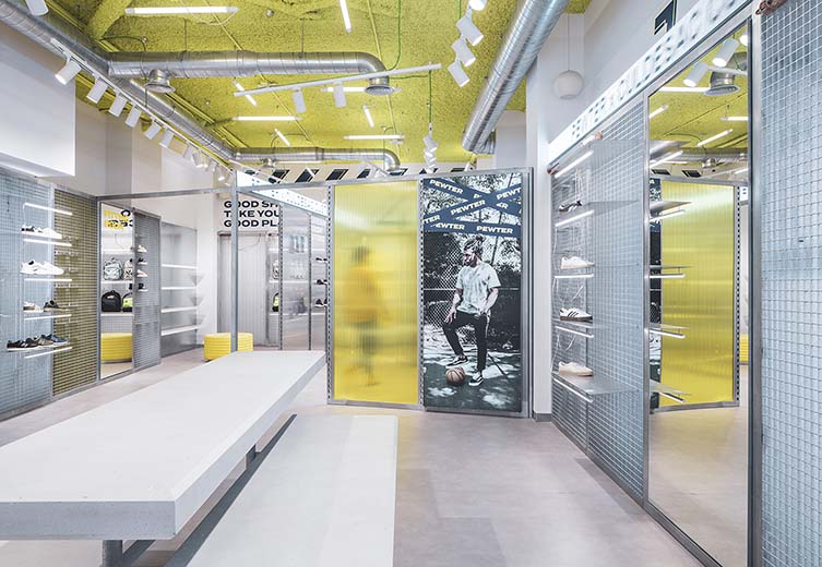
Designed as an extension of the street, Pewter offers a system of various panels on rails to create a modular space. Sometimes by obscuring products through PMMA panels, sometimes by revealing them under coloured panels, or by simply leaving the passage empty.
Selected by 

