The forte_forte store
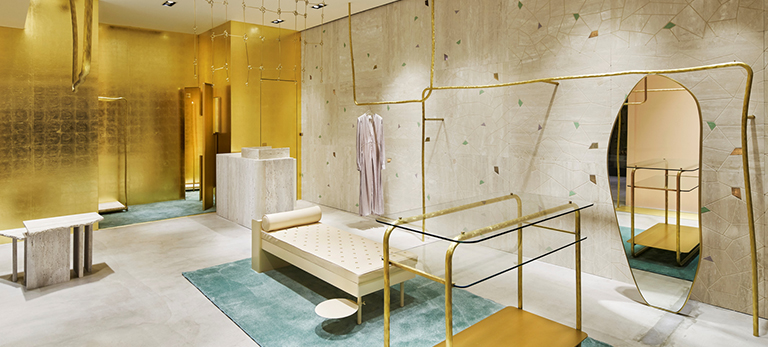
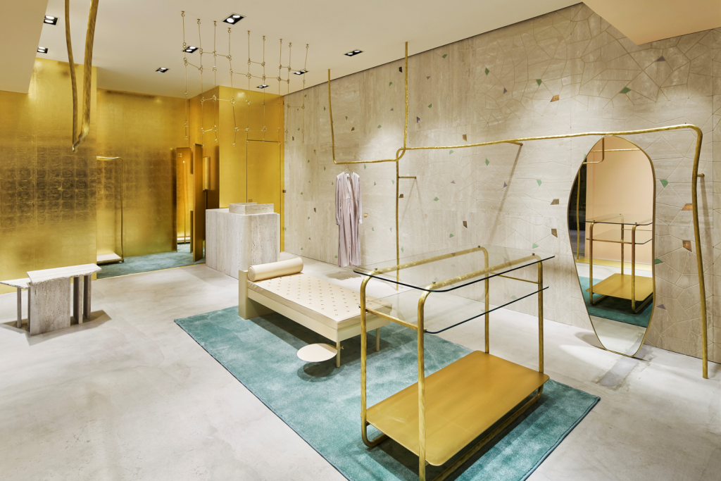
The Italian clothing brand forte_forte has opened its first store in Japan in Tokyo in a shopping centre in Ginza. In the same vein as its Paris, Milan and Spanish stores, the shop welcomes customers in a light and delicate interior with materials that are solid to say the least, combining travertine, brass and gold leaf in its palette.
Selected by
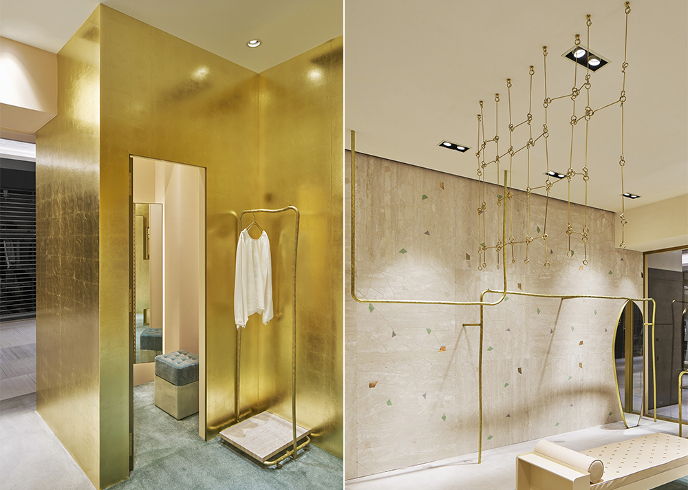
Travertine is used in wall panels scattered with pieces of polished brass and flashes of coloured glass mosaics produced in an old Venetian foundry. In order to set off the limestone dimension of the stone, a wall has been entirely covered in gold leaves concealing the shop’s changing rooms and storeroom.
In line with the brand’s energy, the space reflects a gentle, delicate and feminine character. The clothing racks are also made of brass and are used to define lines in the space.
Selected by
The Freitag concept store
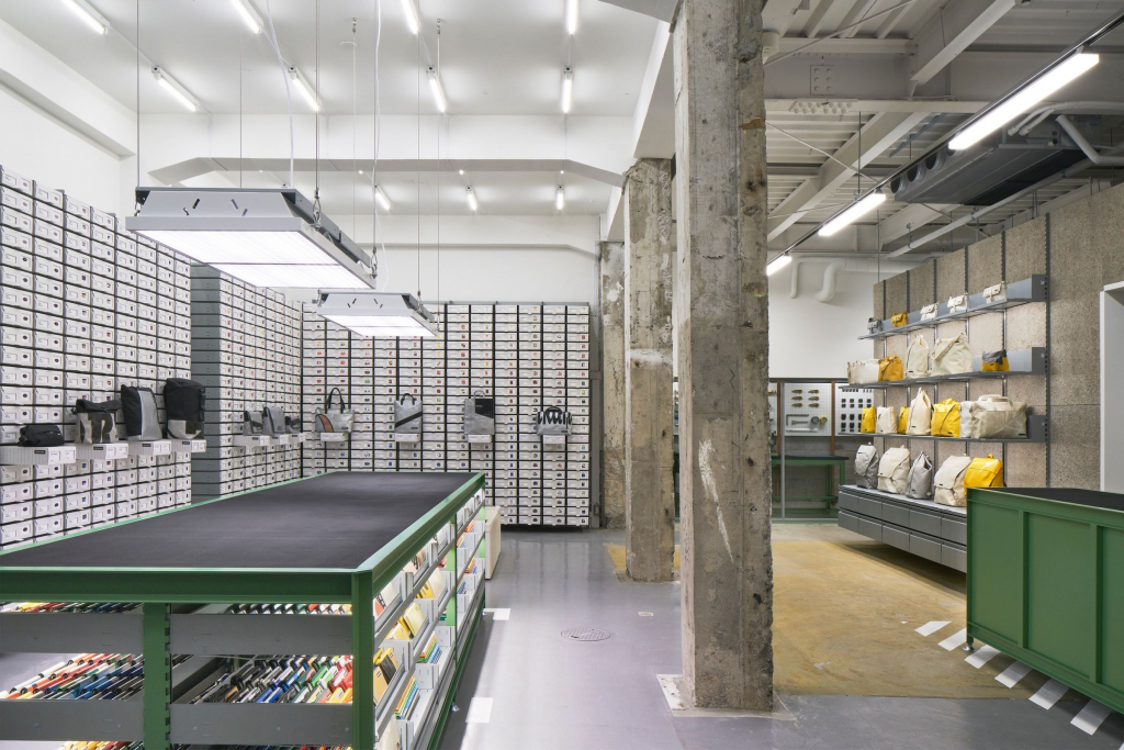
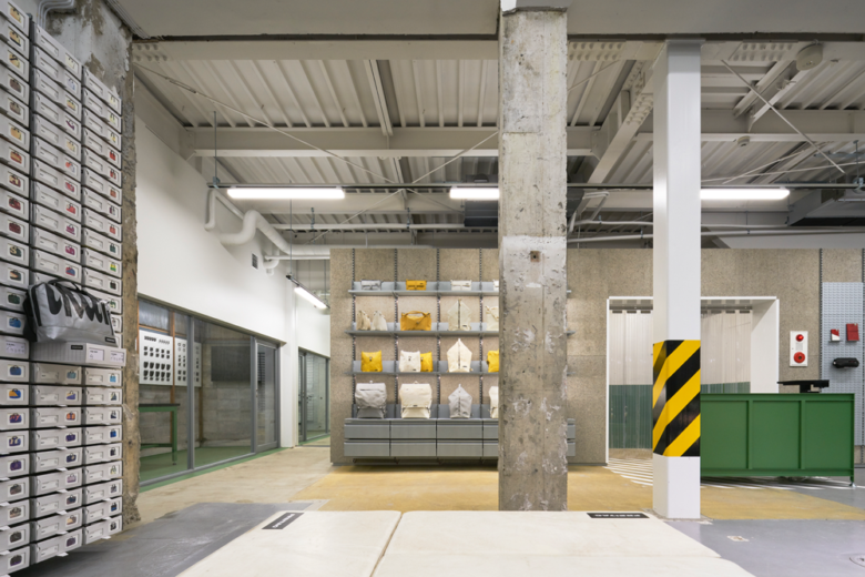
In Kyoto this time, the Swiss brand Freitag has just opened the doors of its latest concept store. In this small 80-m2 space, Freitag shares its passion for the wabi-sabi aesthetic of re-use. Its truck tarpaulins are thus transformed into new bags. Located near the old Nishiki market and Nakagyo-ku metropolitan pedestrian area, the store is entirely inspired by the industrial-style logistics warehouses at the company’s headquarters in Zurich.
Selected by
Designed by Torafu architects, the space has, among other things, its own workshop where customers can create their unique prototypes from tarpaulin off-cuts. In the middle is a large workbench with a rubber top and V100, the brand’s original system. The rest of the store is made of reinforced concrete with rough columns and beams. Reflectors serve to illuminate the island fixture. As is often the case in Japan, a semi-outdoor workspace has been installed.
Selected by
The Acne Studios store
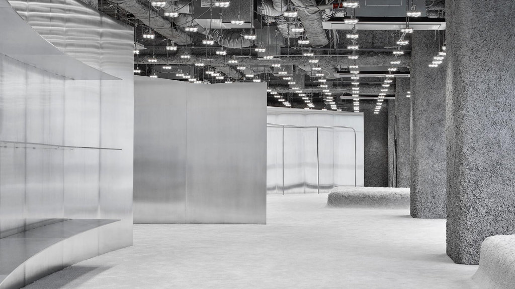
In Nagoya this time, Acne Studios has just set up its latest concept store. Designed by the Spanish architects from the Architectura-G studio, the project covers a 275-m2 space based on the idea of contrasts. They have paired high technology with the softest, most delicate materials. Chaos reigns with order and balance is found between the elements.
Selected by
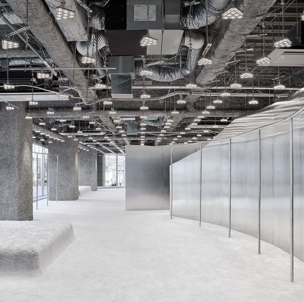
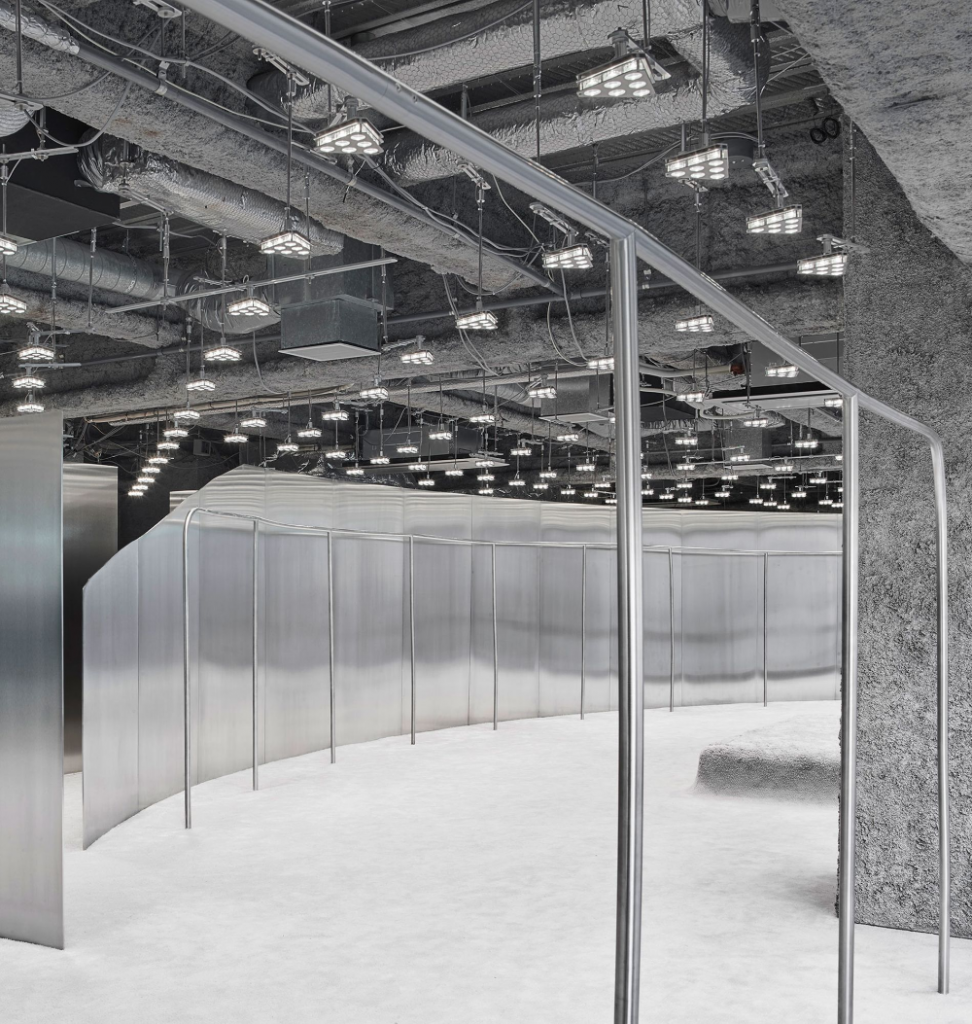
A glass façade on one side allows passers-by to discover the interior, boasting a host of grey and metallic tones. The shop is delineated by curved steel partitions to subtly guide customers as they browse. Panels precision-cut down to the very millimetre are as fine and delicate as paper. This contrasts with the surrounding structural columns. In order to create a dichotomy, the floor is entirely covered with plush carpet. There are just two podiums that serve as seats; everything is in the same tones. To adorn the exposed technical ceiling, Benoit Lalloz has designed lighting fixtures that create a connection between the ceiling and the store.
Selected by
Selected by

