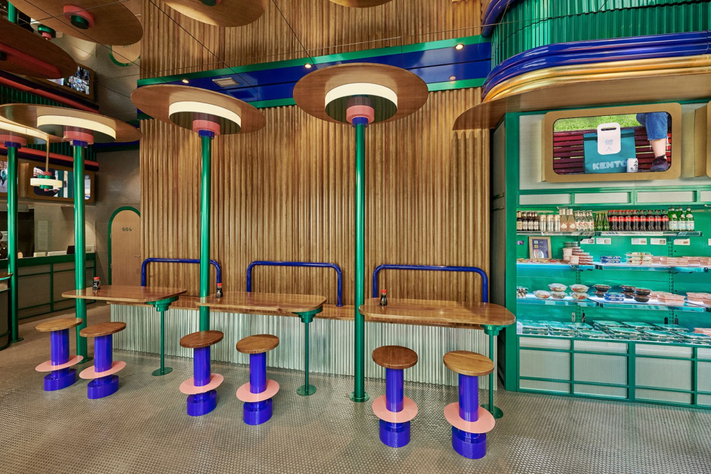
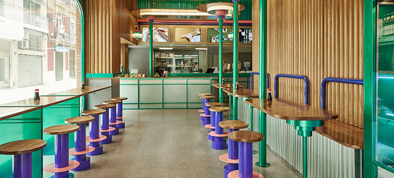
The design studio Masquespacio has designed the third store for Kento Shop, the Valencian takeaway sushi chain. Masquespacio expresses its highly colourful aesthetic and geometric shapes with a retro touch. A mix between an American diner and a traditional Japanese restaurant, the new Kento restaurant stands out with its originality.
A successful concept
Founded by Eduardo Hijlkema, Kento was born of the idea of offering healthier takeaway sushi at an affordable price. Eduardo Hijlkema also had the idea of working with chef Taka Sasaki, a successful YouTuber with over 300,000 subscribers to her Japanese recipe YouTube channel “Cocinajaponesa“.
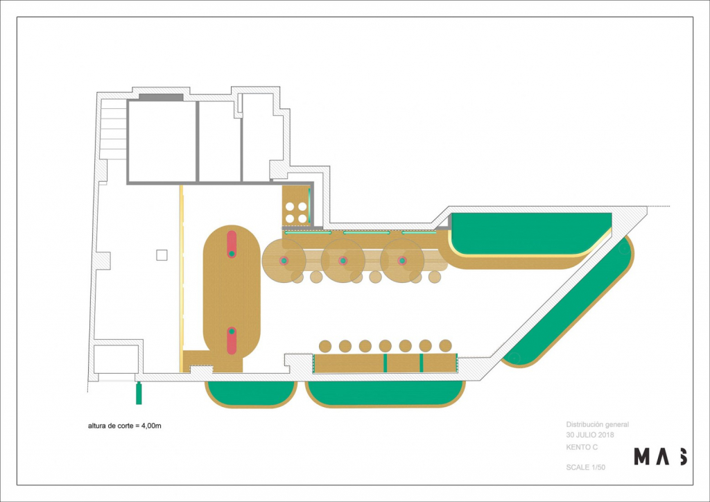
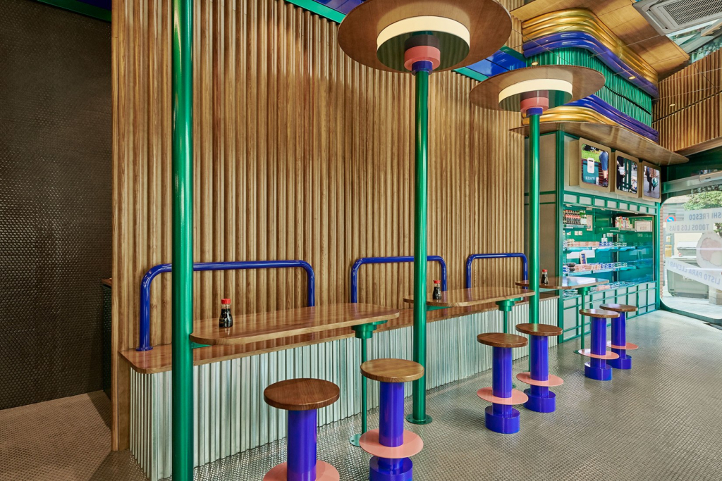
For the design, Kento turned to the Masquespacio studio, which had already created two other restaurants with a highly graphic aesthetic that distinguishes itself from conventional Japanese restaurants with their very standardised, identical design.
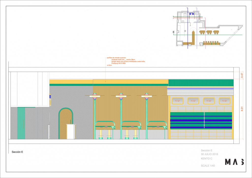
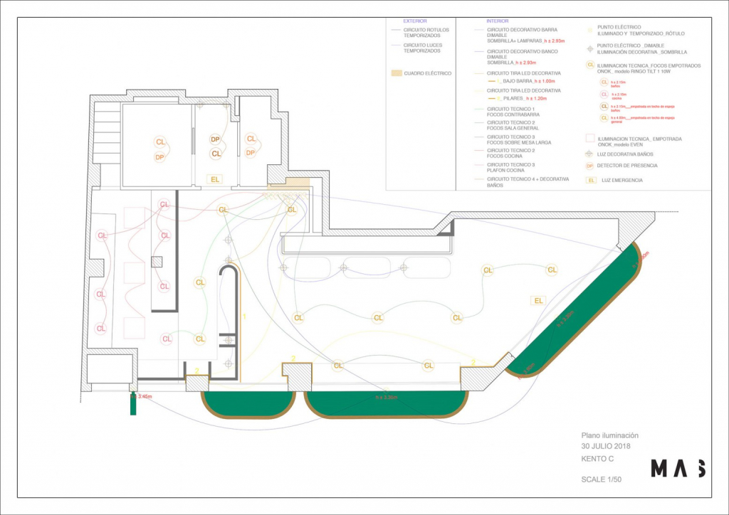
A fun, offbeat design
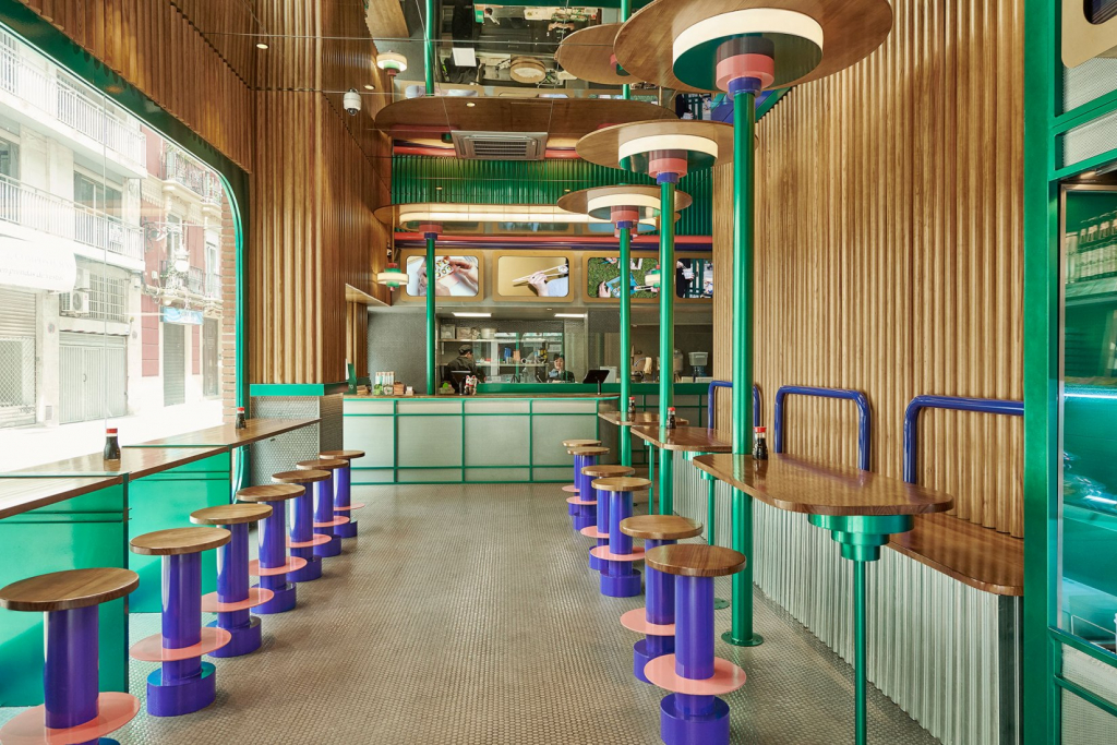
The restaurant boasts a bright, ultra-luminous colour palette featuring electric green, salmon pink, purple and gold. The colour contrast is heightened by the many mirrors arranged on the walls and ceilings, giving the impression of an infinite space.
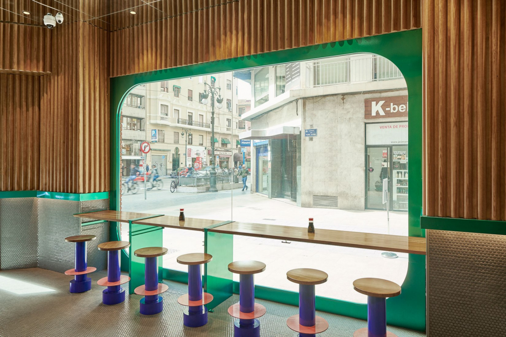
But the restaurant’s biggest surprise lies in the use of wood, cut like large bamboo stems reminiscent of traditional Japanese restaurants. Masquespacio has successfully created a fun, offbeat space aimed at a young, connected clientele in a decor highly imbued with Japanese culture.
